Tinglan (Emma) Liao | 12M
Pencil, Marker and Digital Media:
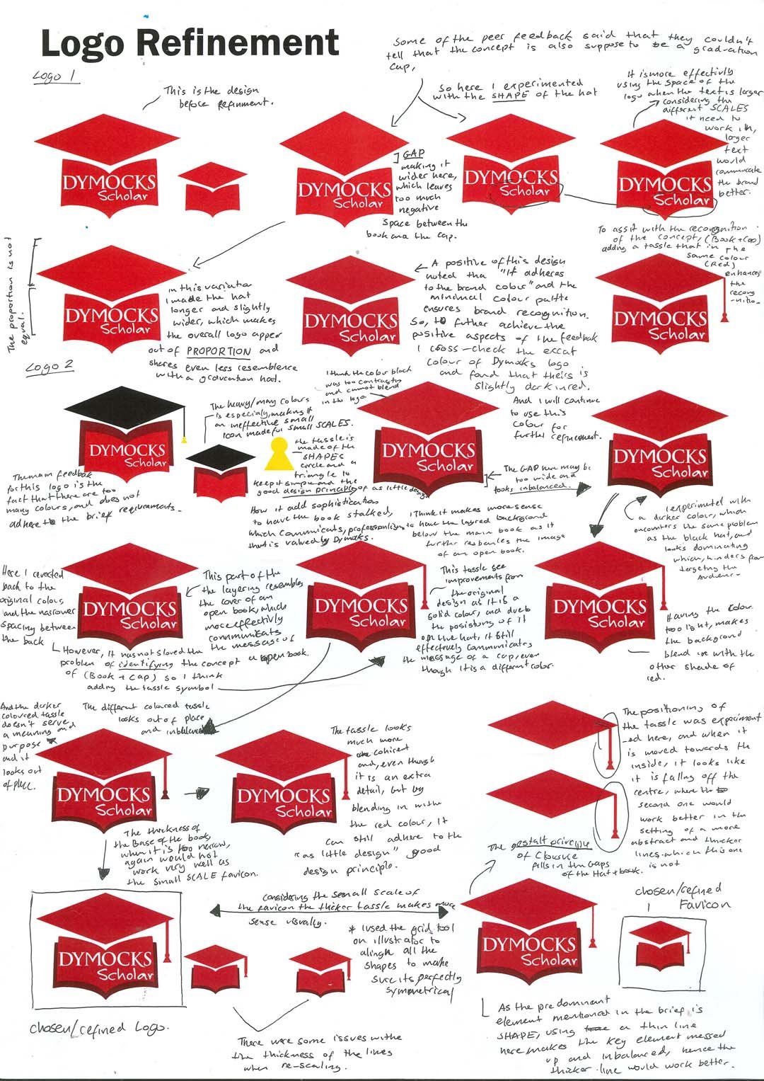
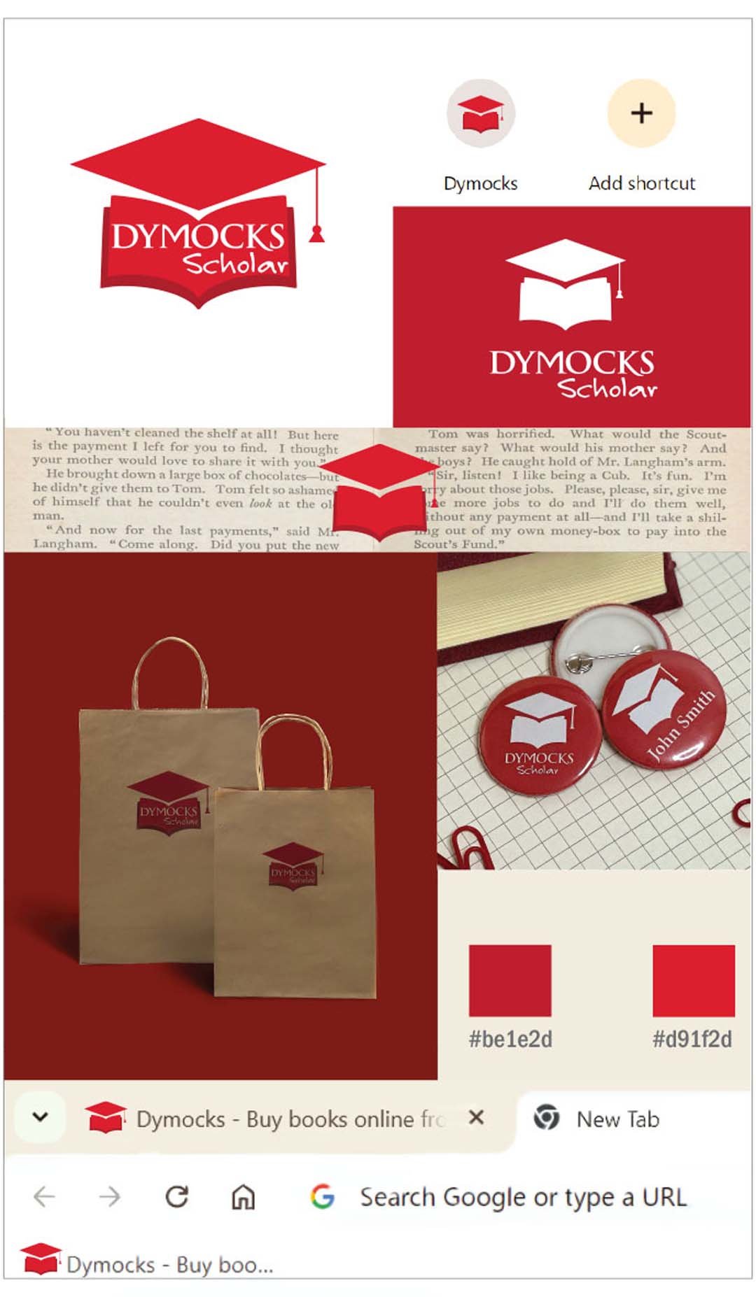
My client is Dymocks is the Australian chain franchise founded in 1879, specialising mostly in the trade of books and publications. They have both physical and online stores across Australia, especially stores in metropolitan areas. Dymocks feels they could do more to capture the interests of student’s scholars and education and have decided to branch out by creating “Dymocks scholar”. Dymocks is looking to create a secondary logo design for the new branch and a promotional poster for a study session, The study session aims to create a place for students to study in a quiet and resourceful area. In the discover stage I was inspired by the shapes and visual language of book, which is also meaning considering the nature of the brand. For the first presentation I utilised the gestalt principle of closure to incorporate both the image of a book and a combined meaning of a scholar hat, which was presented in different context on a presentation board. For presentation 2, the poster embedded the concept of knowledge seeping out of a book combining to create the ordered manner of the study session.


