Leah Mckenzie | 12H
Pencil, Marker and Digital Media:
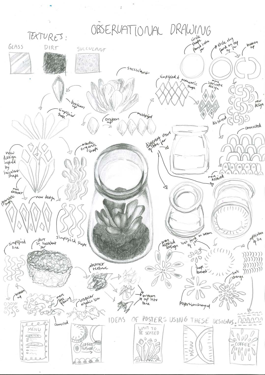
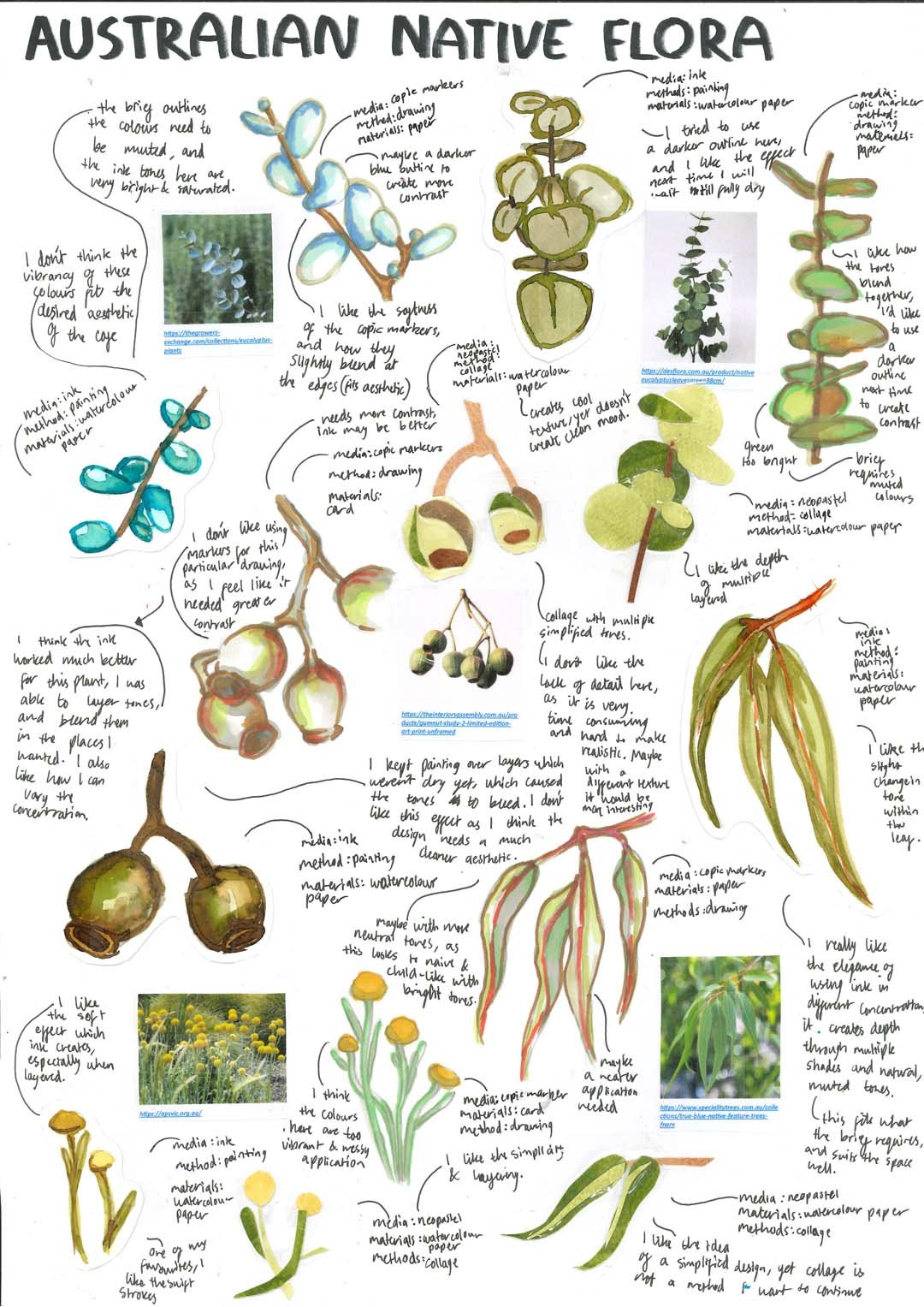
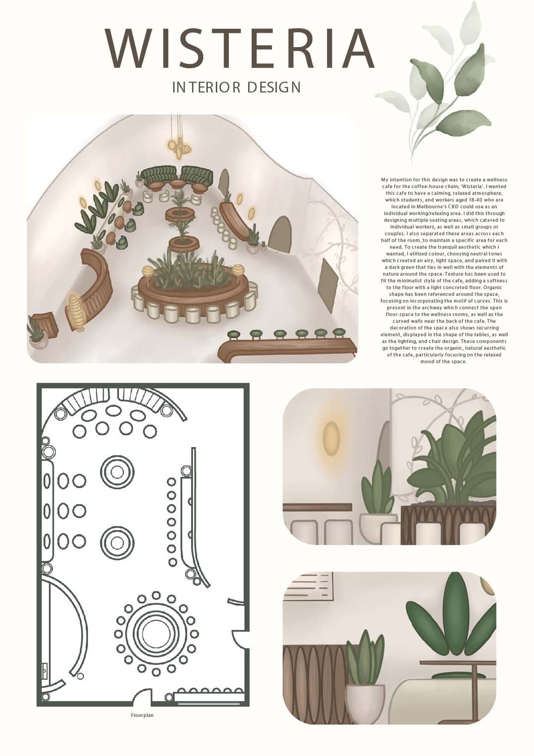
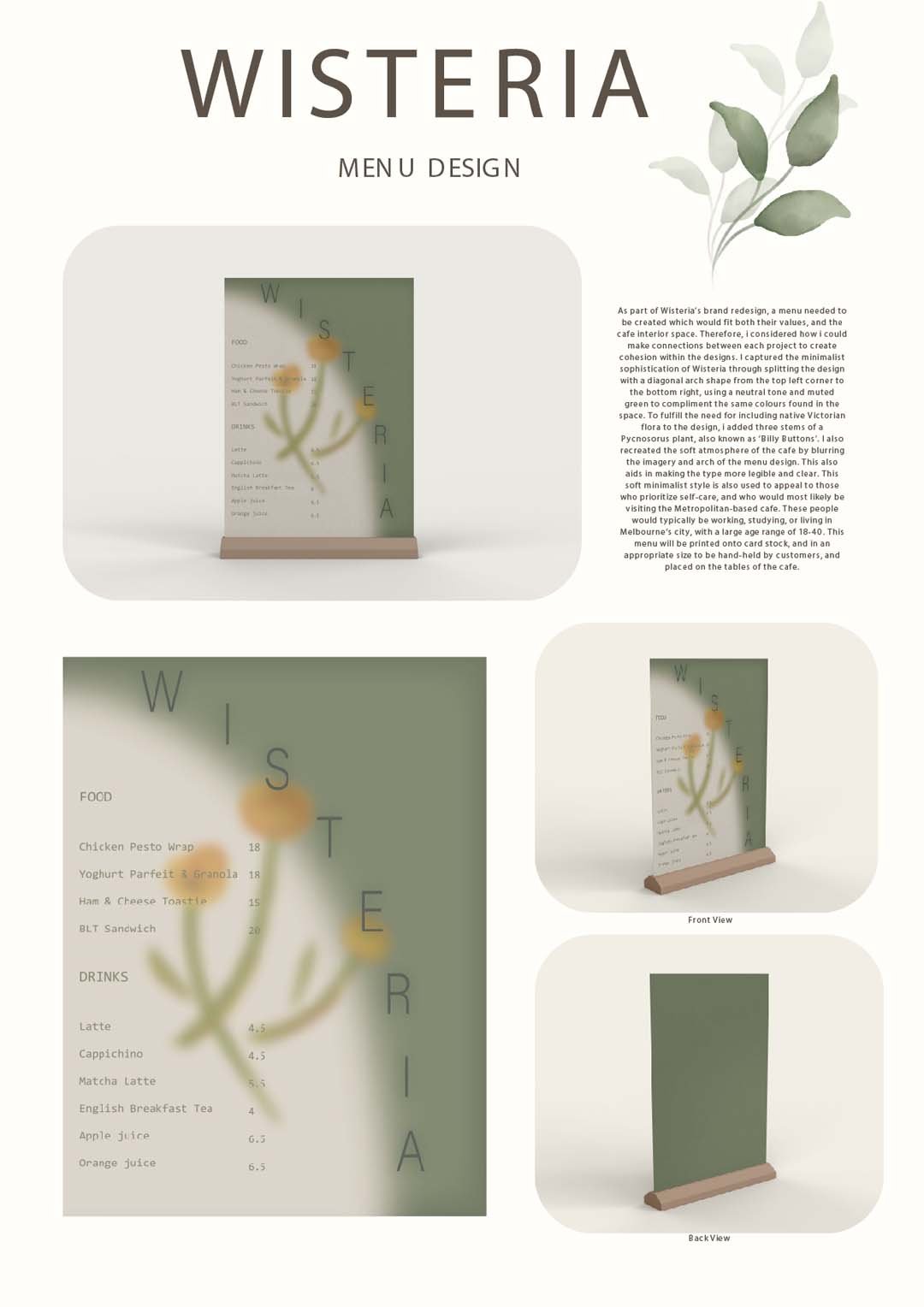
‘Wisteria’ café poses as a space that promotes positive wellbeing among those who visit. It acts as a sanctuary for those who work, study, and live in Melbourne’s City, who are in need of a break from the stressors of everyday life. The space combines relaxation areas with seating dedicated to both eating at the café, and participating in private work or study across the many seating sections. Wisteria caters to individuals mainly, as well as couples and small groups. The atmosphere of the café has a calming, relaxed mood, created through neutral tones and a muted colour palette. It considers the efficiency of space, taking into consideration how individuals can move around the building without interfering with the space of another person in an uncomfortable manner. To complement the space, a menu has been designed to be situated on the tables of the café, and held by those who visit. It outlines the food and beverage options available, while suiting the style of the interior through use of colour and imagery. Both projects also possess elements of nature and nature which is native to Victoria, further helping to ground visitors in their surroundings.

