Jalen Simpson | 12F
Pencil, Marker and Digital Media:
Grounds to Ground, a new café located on Watton Street in Werribee, is struggling to stand out and attract customers due to a lack of brand identity and advertising. Competing against numerous other cafés, they need a strong brand identity that reflects their environmental values and unique services.
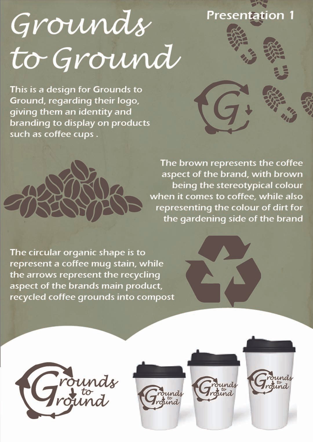
Grounds to Ground is a café that also sells recycled coffee grounds as compost for gardening. Their mission is to inspire environmental awareness while serving quality coffee. They want to stand out by highlighting their commitment to the environment, particularly through the dual services of coffee and gardening. Currently, they lack a distinct logo, color palette, and aesthetic that differentiates them from other local cafés.
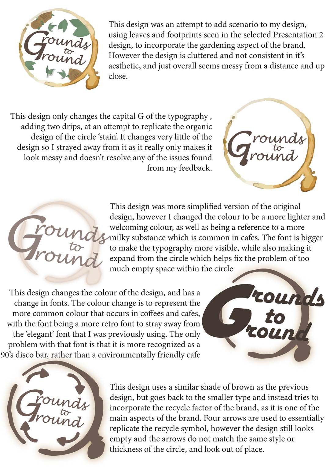
For my first presentation I was tasked to develop a brand identity that reflects the client's values (environmental friendliness) and services (coffee and compost). The design should be visually appealing to passersby and stand out in a competitive street.
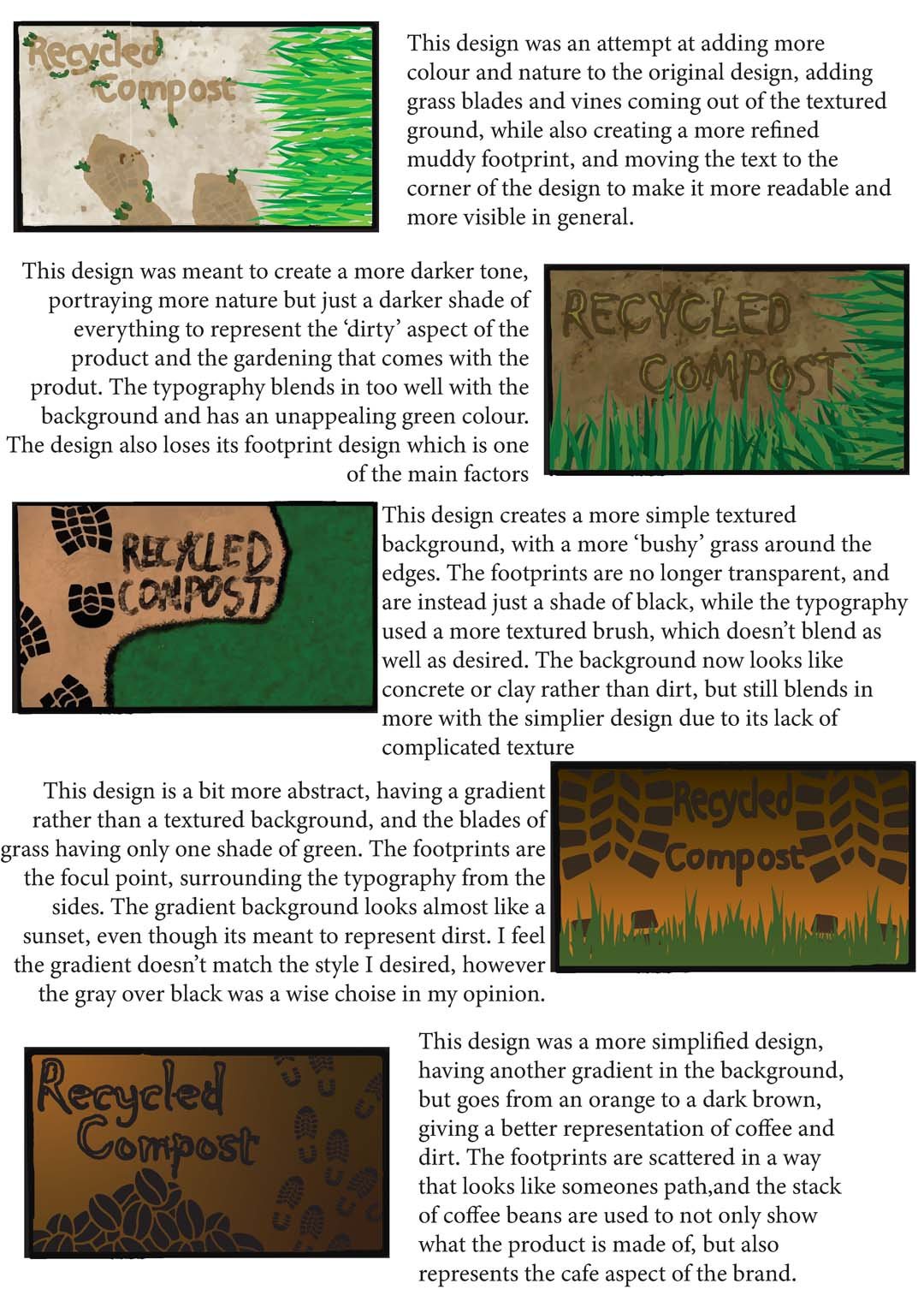
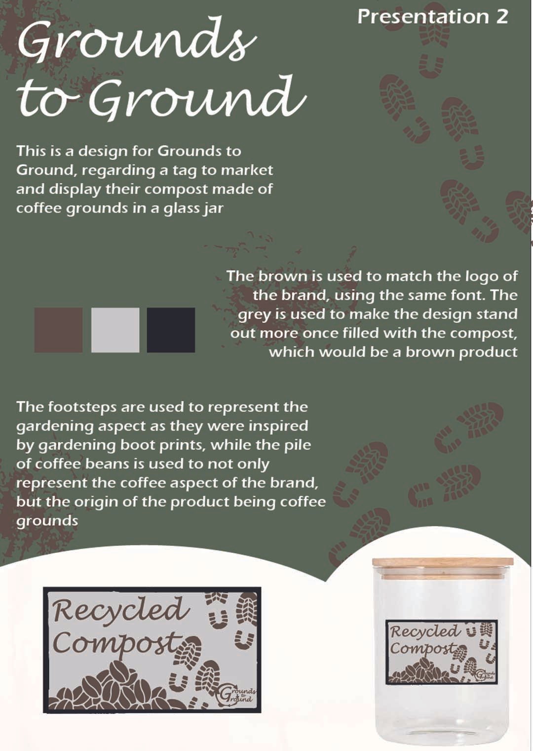
For my second presentation I was tasked to develop a design packaging that can securely hold wet coffee grounds, be compact, and reflect the brand's aesthetic. The requirements were to highlight the client’s values and services, packaging should be durable for wet products and compact, follow the established brand identity, including logo, colors, and name and a presentation board or prototype showing the packaging design for different products.


